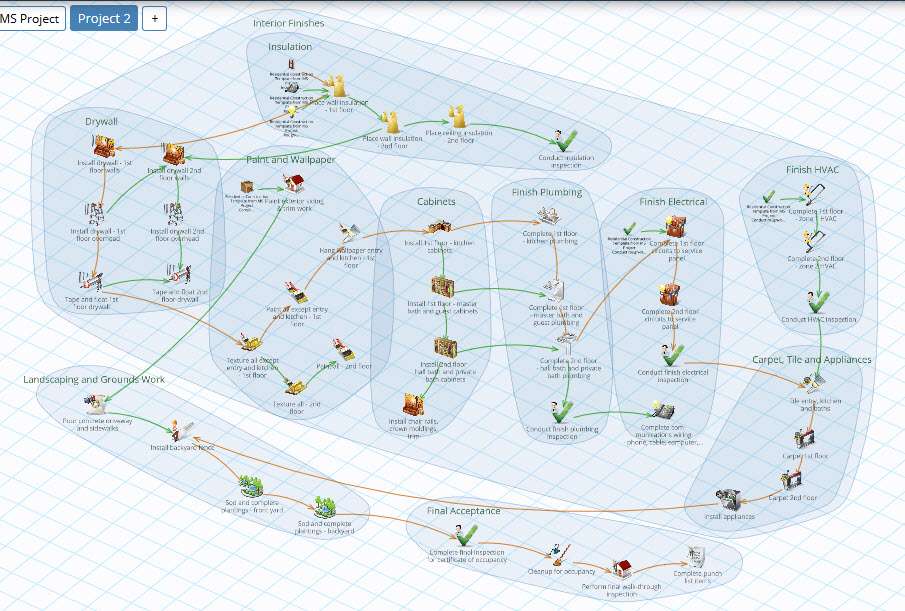
One of our users recently asked for the ability to disable the Whiteboard grid lines. So we added a setting allowing users to enable or disable the Whiteboard grid.
I was surprised by how quickly I preferred working with the grid lines turned off. I found that grid lines competed with the link arrows on the Whiteboard, and disabling them made for a cleaner Whiteboard that was easier on my eyes.
We’ll soon change the default setting for new users, however we avoid change settings for existing users where we can, so existing users can make this change in Plan Settings. The setting is browser specific so you only need to do this once.
Here’s an example of a Whiteboard with and without grid lines. Feel free to let us know which you prefer!
And please keep sending us your feedback. This is how GamePlan continues to improve. Thanks!


Subscribe To Our Newsletter
Get updates and learn from the best
More To Explore
Revolutionizing Collaboration with Concurrent Editing in GamePlan
Exciting news! We’re thrilled to announce a game-changing update to your favourite project planning and scheduling tool — introducing concurrent editing in GamePlan! Say goodbye
Empowering Remote Work with Resource-Specific Timezones
We’re excited to announce a significant enhancement to your project planning and scheduling experience — introducing resource-specific timezone support! In our era of remote work,


